No audio available for this content.
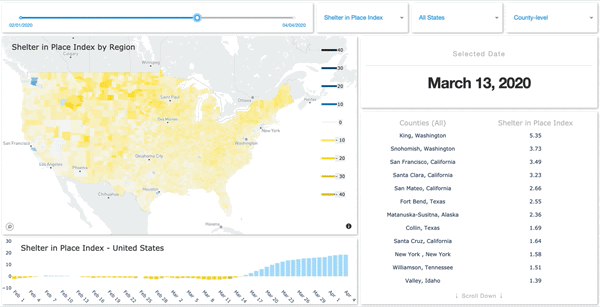
SafeGraph has launched a Shelter in Place Dashboard that enables users to visualize stay-at-home behavior for every county in the United States.
SafeGraph has also created and released two new datasets:
- Weekly foot-traffic patterns
- Social Distancing Index
The data is being provided at no cost to non-commercial entities.
“We currently have over 550 researchers, non-profits and government agencies in a Slack group using these new datasets,” said Evan Barry, vice president of marketing, SafeGraph. Academic and industry research articles based on the data are now published on the SafeGraph site.